Containing Floats
January 20th, 2013
When coding anything that has floated elements, you need to learn how to properly contain them. Otherwise, they will flow outside of their wrapping container.
The problem
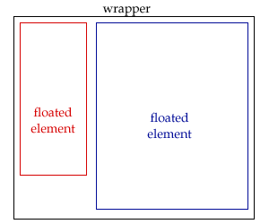
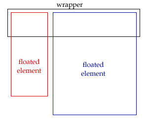
Take a look at these 2 examples.
| Right | Wrong |
|---|---|
 |
 |
The example on the left is how we want the design to look. The wrapper properly contains the floats, so its height actually grows as the floated elements’ heights grow. It’s always outside of the floated elements.
The example on the right is what happens when you don’t properly contain your floated elements. Notice how both of them are extending outside of the wrapper. The wrapper ends up disregarding what is inside of it.
The solution
There are several ways to contain floats, but this tutorial will cover two of them.
We will be using this code as our example.
| HTML | CSS | |
|---|---|---|
|
<div id=”wrapper”> <div id=”navi”> Navigation here </div> <div id=”content”> Content here </div> </div> |
#wrapper { width: 700px; } #wrapper #navi { float: left; width: 200px; } #wrapper #content { float: right; width: 480px; } |
Solution #1: Floats can contain floats
Floated elements can contain other floated elements inside of it. To do this, we just need to float our wrapper. Whether it’s floated left or right doesn’t matter, as long as it’s floated.
| CSS |
|---|
|
#wrapper { width: 700px; float: left; } #wrapper #navi { float: left; width: 200px; } #wrapper #content { float: right; width: 480px; } |
Solution #2: Using overflow hidden
A more flexible trick is to use overflow: hidden; so that you do not have to float the wrapper. This will contain the floats properly just as the previous solution does.
| CSS |
|---|
|
#wrapper { width: 700px; overflow: hidden; } #wrapper #navi { float: left; width: 200px; } #wrapper #content { float: right; width: 480px; } |
Conclusion
As long as your wrapper properly contains the floated elements, they should never fall out of it. There are other ways of accomplishing this as well, though these 2 are my preferred ways.


Leave a Reply