

Setting up font-size and line-height
January 20th, 2013
I set up my font-size with em and my line-height with a unitless number. I’ll be going over how to do this, and why I like doing it this way.
Using em for your font sizes can be a confusing change from px/pt, and I’m hoping I can clear some of it up with this article. First off, why even use em over px/pt?
Benefits for your visitors
Using em is more flexible for your visitors. Resizing text is an option that should be available to your visitors. A visitor’s monitor and resolution may make text harder to see on theirs than yours, and visually impaired users may always want their default text larger.
Let’s look at IE8 when text is sized with px. It doesn’t matter what I set my Text Size to. It’s not changing. (The same problem happens with pt.)
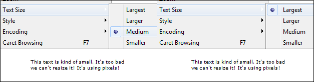
It’s not just an IE issue. Look at Firefox. In my options, I decided to set my default font size larger. Again, it makes no difference when using px or pt.
Using em, on the other hand, will allow text resizing.
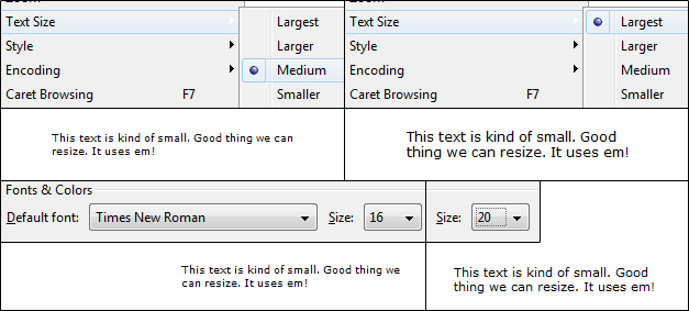
(Note: I am aware that “zooming” works which makes everything bigger. This is not the same as changing only the text size.)
Benefits for yourself
Using em can also be easier on yourself when coding. For example, if I told you some text inside of a div is set to 13px, can you tell if that’s larger, smaller, or the same as the normal text? You can’t without context. You need to find out what the default size is set to on your normal text.
In this tutorial, I will be going over how to set up 1em. From there, it’s easy to tell the size relative to the normal text. 1.2em? It’s larger. 0.9em? It’s smaller. Easy.
What if you realized you need all of the text to be bigger. Let’s look at an example that has a layout wrapper. I will highlight all the places that need to change for this to happen.
| body {
font: 12px Arial, sans-serif; line-height: 18px; } h1 { font-size: 20px; line-height: 26px; } p.excerpt { font-size: 10px; line-height: 14px; } |
body {
font: 62.5% Arial, sans-serif; } #wrapper { font-size: 1.2em; line-height: 1.6; } h1 { font-size: 1.8em; } p.excerpt { font-size: 0.8em; } |
On the left side with pixels, I’d have to change all of the font sizes and line heights. In the example on the right, you’ll notice I only change one value. Everything that is inside the wrapper will inherit from that change, and I don’t have to change the line-height because it stays relative to the font size (will be explained later).
Using em with font sizes
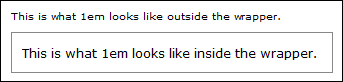
For starters, think of 1em as your default font size. In the most commonly used browsers, it’s set to 16px by default, so 1em = 16px. Honestly, I don’t find that easy to work with. It’d be better if it were a nice number like 10px. Luckily, we can do that by reseting the font size with percentages.
| body {
font: 62.5% Verdana, Arial, sans-serif; } |
With this, 1em = 10px because 62.5% of 16px = 10px. Now it’s easier to do conversions. For example, 9px = 0.9em, 11px = 1.1em, etc.
I want the default text inside my layout wrapper to be 12px. Since 1em is 10px, 1.2em is 12px.
| body {
font: 62.5% Verdana, Arial, sans-serif; } #wrapper { font-size: 1.2em; } |
This makes 1em = 12px inside #wrapper. (This means the default size inside #wrapper is 12px.)
As mentioned before, I can now size my text relative to this. For example, 1.1em is just a little bigger. 2em is twice the size. If I want text smaller, I size down from 1em, such as 0.9em, 0.8em, etc.
If you wanted to start with 12px to begin with, you can. There’s nothing wrong with that. Use 75% instead. (75% of 16x = 12px).
Using unitless with line heights
Since we’re sizing font sizes with em, should we do the same with line-height? There are different thoughts on this. My personal preference is: No.
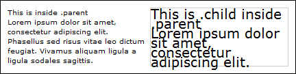
When you use a unit for line-heights, whether it’s em, px, pt, or %, you pass that computed value to its descendents. For example, what if we had these parent and child elements:
| .parent {
font-size: 1em; line-height: 1.4em; } font-size: 2em; } |
Let’s assume 1em = 10px. So, line-height of 1.4em is 14px. Our child element is larger at 20px. Does the line-height size up to the larger text size? It doesn’t. Even at 20px, it still has a 14px line-height, making the text squish together.
When you use a unitless line-height, it will adjust relative to the font size. It gets passed on as a multiplier.
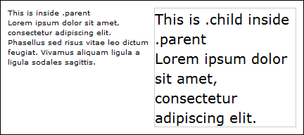
| .parent {
font-size: 1em; line-height: 1.4; .parent .child { font-size: 2em; } |
Notice it’s just a number – no unit attached at the end. Now the line height will be relative to the font size. Look how it sizes up and how the text is spaced out properly now.
(Sources: meyerweb, mozilla dev)
Summary
In short, we have 3 parts:
- With em, browsers will allow users to resize the text. This does not happen with px or pt.
- You can use percentage to reset the default font size. Since the default is often 16px, I like using 62.5% to make my default at 10px.
- When line-heights are unitless (instead of px, pt, em, or %), it will adjust relative to the text size. It gets passed as a multiplier instead of a computed value to its descendents.
An example of how I typically code my CSS for font sizes may look like this:
| body {
font: 62.5% Verdana, Arial, sans-serif; } #wrapper { font-size: 1.2em; line-height: 1.6; } h1 { font-size: 1.8em; } p.excerpt { font-size: 0.9em; } |

Leave a Reply